10 HORRIBLE First Logos Of Major Brands 🤮

Have you ever wondered how some of the biggest brands in the world got their start? Well, prepare to be shocked by the first logos of these major companies. From awkward designs to cringeworthy concepts, these initial attempts may make you thankful for the professional logos we know and love today. In this blog, we will take a trip down memory lane and explore 10 of the most horrible first logos of major brands. Get ready to cringe, laugh, and maybe even appreciate just how far these companies have come since their humble beginnings. Let’s dive in and take a look at the logos that these brands probably want you to forget!
10 HORRIBLE First Logos Of Major Brands 🤮
Hey guys, what’s going on it’s me Will Patterson and welcome back to the new video. Today, we’re going to be looking at the first logos of major corporations and trust me, you’ll be surprised and amazed. Let’s dive in!
Apple
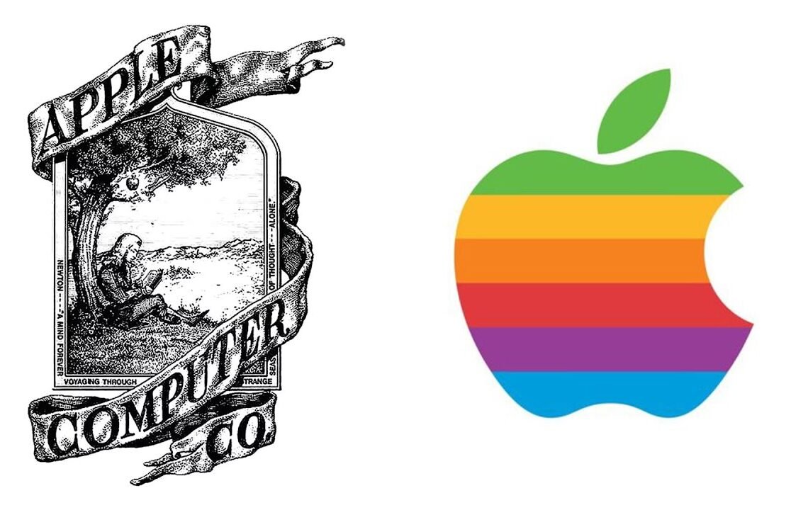
Everyone is familiar with the iconic Apple logo, known for its simplicity and design. But did you know that Apple’s first logo was incredibly complex? The first Apple logo featured Isaac Newton sitting under a tree with an apple about to fall on his head. It was a vintage design with a serif font, a far cry from the modern Apple logo we know today.
Twitter’s first logo was a green, slimy design that looks nothing like a social networking company logo. It’s interesting to see how Twitter’s logo evolved over time to the familiar blue bird we know today.
McDonald’s
McDonald’s went through several logo iterations before settling on the golden arches. From the BBQ McDonald’s logo to the McDonald’s coast-to-coast design, it’s fascinating to see how the logo evolved over the years to become the recognizable symbol it is today.
Amazon
Amazon’s current logo is known for its creativity, with an arrow from A to Z symbolizing the wide range of products they offer. But their first logo was a minimalist design resembling a river or landscape view. It’s interesting to see how their logo evolved over time to the sleek design we know today.
Pepsi
The current Pepsi logo is a red and blue circle with a grin, but their first logo was a surprising ornate design that looks like amateur hand lettering. It’s a stark contrast to the minimalistic and sleek design of their current logo.
Sony
Sony’s first logo was a puzzling design that bears no resemblance to their modern logo. The concept looks similar to the HP logo, showcasing a dramatic difference in design evolution over the years.
As we look at the first logos of these major brands, it’s fascinating to see how design trends have evolved over time. From complex and ornate designs to sleek and minimalist logos, these first logos provide a glimpse into the creative evolution of these iconic brands.
FAQ About Horrible First Logos of Major Brands
- Q: What are some examples of major brands with horrible first logos?
- A: Some examples include Starbucks, McDonald’s, Apple, and Pepsi.
- Q: Why were these logos considered horrible?
- A: These logos were often poorly designed, unappealing, and lacked any connection to the brand’s identity.
- Q: How did these brands evolve their logos over time?
- A: Through rebranding efforts, these brands were able to modernize their logos, making them more visually appealing and reflective of their brand identity.
- Q: Can a bad logo impact a brand’s success?
- A: Yes, a poorly designed logo can affect a brand’s reputation and perception in the eyes of consumers, potentially leading to a decrease in sales and brand loyalty.
I hope you find useful my article 10 HORRIBLE First Logos Of Major Brands 🤮, I also recommend you to read my other posts in my blog.
If you need help with anything join the community or do not hesitate to contact me.
Please consider joining my newsletter or following me on social media if you like my content.


Leave a Reply