How To Create STUNNING Layouts – 5 Tips 😲
Are you struggling to create stunning layouts for your designs? Do you often find yourself feeling stuck and uninspired? Creating a visually captivating layout is essential for grabbing and holding the attention of your audience. Whether you’re working on a website, a poster, or a social media graphic, the layout plays a crucial role in the overall impact of your design. But don’t worry, we’re here to help! In this blog, we’ll be sharing five tips to help you create stunning layouts that will leave a lasting impression on your audience. From utilizing white space to playing with grid systems, these tips will help take your designs to the next level. Let’s get started!
…and it’s just a mess on a page try and restrict yourself because repeating elements and consistency allows for a much clearer and better layout so let’s look at this poster again i’ve repeated the color red and the color white all over this page in all of my designs but now it’s the consistency from top to bottom that allows for an easier read so if you look at the typography in this that there’s a lot of repetition three program lets uh ad infinitum and bespoke poster there’s consistency in the font and the color so what you get is an easier read imagine you went crazy with not finding a typeface and using lots of grids and not repeating any elements and it would just be a mess but what makes a clear layout is the repetition and consistency of elements so that’s a pretty boring tip but it’s pretty important i think but i’ll move on to another one that’s a bit more exciting and that is white space white space is simply blanket space that’s left vacant i think it’s so important but so under utilized i’ve seen many bad layouts and it’s where there’s just nothing going on on the page there’s an image and then so and so’s hot dogs or whatever it is just in the middle of the page there’s no blank space but what white space does is allow the assets to breathe and what i mean by that is if i crammed every single thing onto this poster without letting the illustration breathe or having air between the illustration and the typography it makes the layout look chaotic you want everything to flow and you want little resting points for your eyes and a spac20ng that everyone says is like the godfather of typography says that blank space is the silence in a piece of music it allows for the notes to sing now what he means by that is when there’s no blank space the notes are just all on top of each other and there’s a mess but when there’s blank space and they’re allowed to breathe then the music can sing or your design can flow with the page so that is white space and it’s not using ribbons and bows or fancy things that make up an amazing layout it’s the use of leaving nothing there to create such a clear and perfect balance without leaving you feeling overwhelmed the final tip i’m going to give you is thinking about the design in different contexts you can’t just design for print anymore it’s not that simple to devise your design for instagram or Facebook or whatever context you’re in so when you design you’ve got to think about them all why would a poster have a lot of typography for people to read at 2 meters away you could do the same for a flyer now if you think about a facebook post in a haut context with a lot of text or a tweet you don’t need all of that information you’d probably need a full bleed image with some text saying tune in tonight whatever it is so the different context that you design in can be provocative to how you layout information on that graphic context is a big deal and i think it doesn’t get enough mention in traditional graphic design classes so let’s run through the five tips i just gave you today well you’re first going to use grids these aren’t just boxes guides that you put down on the page they can get super weird and they allow you to place assets in an orderly fashion the rule of thirds is a good simple grid to use for proportions and composition on the page then we’ve got repeating elements this is consistency with elements to give you a more professional and easier to read layout white space if you leave no blank space on your layout it can look really chaotic it gives the assets room to breathe and then the context of the design different layouts for different social media platforms different print types these are all big deals so that’s it for this video and we hope that you can enjoy these layout tips to lead to better more clearer and graphic design that sets you apart thanks again to millernote for sponsoring this video if you haven’t already check out their amazing notebooks over at their website thank you i’ll see you in the next video and good night.
FAQ
1. What are some tips for creating stunning layouts?
To create stunning layouts, consider using a grid system for consistency, incorporating white space for a clean and modern look, using high-quality images, choosing a cohesive color scheme, and utilizing typography to create hierarchy and visual interest.
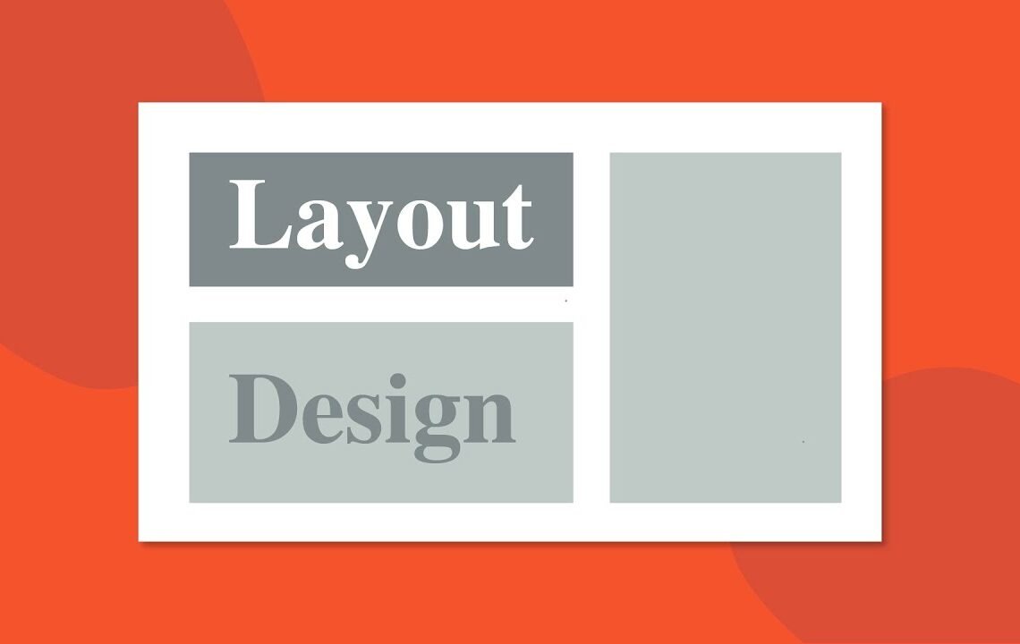
2. How can I use a grid system for my layout?
You can use a grid system by dividing your layout into columns and rows, ensuring that your elements align and have consistent spacing. This helps create a structured and organized design.
3. Why is white space important in a layout?
White space, or negative space, helps to reduce clutter and allow the elements in your layout to breathe. It also creates a sense of balance and elegance in your design.
4. What are some tips for choosing high-quality images for my layout?
When choosing images, make sure they are high resolution, relevant to your content, and visually appealing. Consider using stock photos or professional photography for the best results.
5. How can I create a cohesive color scheme for my layout?
To create a cohesive color scheme, start with a base color and choose complementary or analogous colors to create a harmonious palette. You can also use color tools or resources to help you find the perfect combination for your layout.
I hope you find useful my article How To Create STUNNING Layouts – 5 Tips 😲, I also recommend you to read my other posts in my blog.
If you need help with anything join the community or do not hesitate to contact me.
Please consider joining my newsletter or following me on social media if you like my content.
Leave a Reply