Critiquing Your Logo Designs on Reddit! Ep10 🚀
Are you struggling with creating the perfect logo design for your business or brand? Do you want feedback and constructive criticism from fellow designers and enthusiasts? Look no further! In this episode, we will be exploring the world of logo design critiquing on Reddit. Join us as we dive into the diverse community of designers and share our top tips and tricks for getting the most out of critiquing your logo designs. Whether you’re a beginner or a seasoned pro, there’s something for everyone in this exciting world of design feedback. So, get ready to learn, grow, and improve your logo designs with the help of the Reddit community!
Critiquing Your Logo Designs on Reddit! Ep10 🚀
If you’re one of the 2,000 members on our subreddit, then you’re in for an exciting episode! Today, I’ll be critiquing your logo designs and brand identity projects. I’ll also be rewarding the ones I like the most with some Reddit coins. Let’s dive in!
Primary Pineapple: A Unique Personal Project
The logo design by Primary Pineapple is definitely unique and showcases attention to detail. However, the concept may need further explanation. The use of negative space and the overall simplicity of the design are commendable, making this logo scalable and versatile.
Flint and Flame: A Sportswear Brand Logo
This logo, designed for a premium and modern sports brand, shows promise. However, it bears a resemblance to another popular logo, which may affect its originality. The use of negative space and the choice of typeface are commendable, and the presentation of the design is well-executed.
Wellness App Logo: A Calming and Professional Design
The logo for the wellness app “Haven” exudes calming vibes and professionalism. The color choice and typeface align with the app’s purpose, and the icon conveys a message of caring and well-being. The use of negative space is effective, and the design is well-suited for app icons.
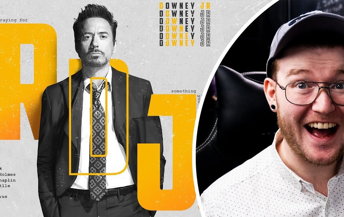
Robert Downey Jr. Poster: Grungy and Symmetrical
The poster design of Robert Downey Jr. showcases a great color scheme, grunge textures, and a well-executed composition. The use of masking and the attention to symmetry are commendable, but adjustments to the spacing could enhance the overall visual impact.
Unspoken News Media: A Thoughtful Illustrative Logo
The logo for Unspoken News Media showcases creativity and attention to detail in its illustrative design. The use of negative space is effective, but it leans more towards an illustration rather than a logo. However, the concept and execution are commendable.
Overall, the designs critiqued in this episode demonstrate creativity and attention to detail. Each designer has showcased unique elements and concepts in their work, making them worthy of recognition and appreciation.
Looking forward to seeing more amazing designs in the next episode!
Frequently Asked Questions
1. Can I submit my logo design for critique on Reddit?
Yes, you can submit your logo design for critique on the Critiquing Your Logo Designs on Reddit! Ep10 🚀 thread. Make sure to follow the guidelines provided by the moderators.
2. What kind of feedback can I expect to receive?
You can expect to receive constructive criticism and suggestions for improvement on your logo design. The community will provide feedback on the overall design, color choice, typography, and other elements.
3. How should I respond to feedback on my logo design?
It is important to be open to feedback and take the critiques in a constructive manner. You can ask clarifying questions and seek further advice on how to improve your design.
4. Are there any rules I should be aware of before posting my logo design for critique?
Yes, make sure to read and follow the rules and guidelines set by the moderators of the subreddit. Some common rules include providing context for your design and being respectful towards other members.
5. Can I submit multiple logo designs for critique?
It is best to focus on one logo design at a time to receive comprehensive feedback. If you have multiple designs, consider submitting them in separate threads to ensure each one gets the attention it deserves.
I hope you find useful my article Critiquing Your Logo Designs on Reddit! Ep10 🚀, I also recommend you to read my other posts in my blog.
If you need help with anything join the community or do not hesitate to contact me.
Please consider joining my newsletter or following me on social media if you like my content.
Leave a Reply