5 MIND BLOWING Typography Tips For Designers 🤯
Have you ever struggled with creating visually appealing typography for your designs? Typography plays a crucial role in design and can often make or break the overall aesthetics of a project. Luckily, there are several tips and tricks that can help you take your typography skills to the next level. In this blog post, we will discuss 5 MIND BLOWING typography tips that will help you create stunning designs that will leave a lasting impact on your audience. From experimenting with different fonts to mastering the art of kerning, these tips are sure to elevate your design game. Let’s dive in and explore how you can level up your typography skills! 🤯
Welcome to 5 MIND BLOWING Typography Tips For Designers 🤯
Hey guys! What’s going on, it’s me W Patterson. In today’s video sponsored by Skillshare, I’m going to be showing you five mind-blowing typography tips for any graphic designers. These tips will seriously help your typography game. So, let’s dive right in!
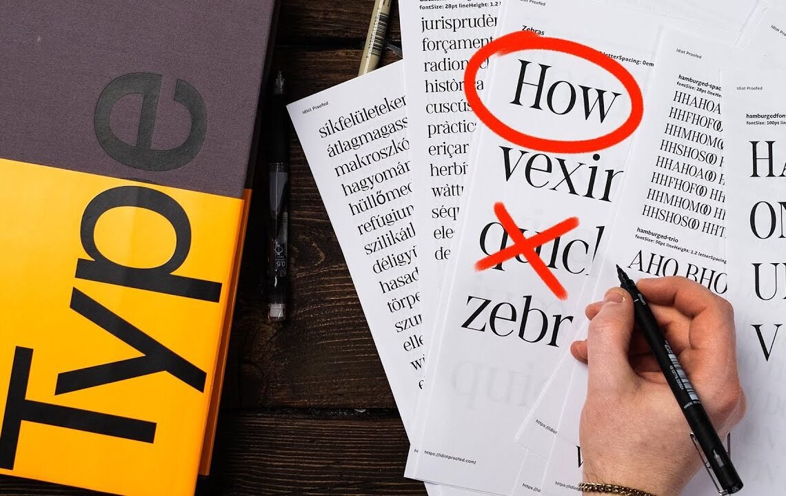
Tip #1: How to Kern Professionally
Some people call me the Kern police for a reason. Here I’ve got an example of bad kerning. This font is Helvetica. To learn how to kern, you need to understand that kerning is the space in between individual characters, not the spacing between all characters which is called tracking.
To adjust the kerning, press option or alt and use the arrow keys. This will move the characters closer or further apart. Make sure to look for even spacing throughout each letter for optimal kerning.
Tip #2: Understanding Software Options
When bringing in a font, make sure to set it to ‘metrics’ for the exact kerning chosen by the type designer. Avoid using ‘optical’ as it can override the designer’s kerning and make it less legible. Use ‘optical’ sparingly, mainly for logo types or headlines that need custom kerning.
Tip #3: Creating a Harmonious Type System Using the Golden Ratio
Start by determining the baseline for your body text, which is the text that readers spend the most time reading. Use the rule of 7-10 words per column for optimal readability. Adjust the text size and leading to create a harmonious type system.
Tip #4: Experiment with Different Font Combinations
Don’t be afraid to mix and match different fonts to create visually appealing designs. Experiment with serif and sans-serif combinations to find a balance between readability and style. Play around with font weights and sizes to create hierarchy and visual interest in your designs.
Tip #5: Use Typography to Enhance Your Brand Identity
Typography plays a crucial role in defining your brand’s identity. Choose fonts that reflect the tone and personality of your brand. Use custom typography or lettering to create a unique and memorable brand identity. Consistency is key when using typography across different platforms and materials.
By implementing these typography tips, you can elevate your designs and create visually stunning work that captures attention and communicates your message effectively. Remember, typography is not just about choosing a font, it’s about how you use it to enhance your design. So, go ahead and experiment with these tips to take your typography game to the next level!
FAQ
1. Why is typography important in design?
Typography plays a crucial role in design as it helps convey the message effectively and enhances the overall aesthetic appeal of the visual content.
2. How can I choose the right font for my design?
When choosing a font for your design, consider the tone and message you want to deliver. Select a font that aligns with your brand identity and ensures readability.
3. What is the importance of font pairing?
Font pairing is essential in design as it helps create contrast and hierarchy, making the text more visually appealing and easier to read.
4. How can I create visual hierarchy with typography?
To create visual hierarchy, you can use different font sizes, weights, and styles to emphasize important information and guide the viewer’s attention.
5. What are some common typography mistakes to avoid?
Some common typography mistakes to avoid include using too many different fonts, improper spacing, and neglecting the readability of the text.
I hope you find useful my article 5 MIND BLOWING Typography Tips For Designers 🤯, I also recommend you to read my other posts in my blog.
If you need help with anything join the community or do not hesitate to contact me.
Please consider joining my newsletter or following me on social media if you like my content.
Leave a Reply