Hellvetica: A Graphic Designers WORST Nightmare 🤮
Have you ever wondered what the ultimate nightmare for a graphic designer might be? Look no further than Hellvetica – the twisted, distorted version of the beloved Helvetica font that is sure to make any designer’s skin crawl. Created by the evil minds at Viget, Hellvetica is a devilish parody of the classic typeface, with uneven spacing, jagged edges, and an overall chaotic appearance. In this blog, we’ll explore the origins and impact of Hellvetica, as well as provide tips on how to avoid falling victim to this graphic designer’s worst nightmare. Are you ready to dive into the dark world of Hellvetica? Let’s get started.
Welcome to Designer Hell
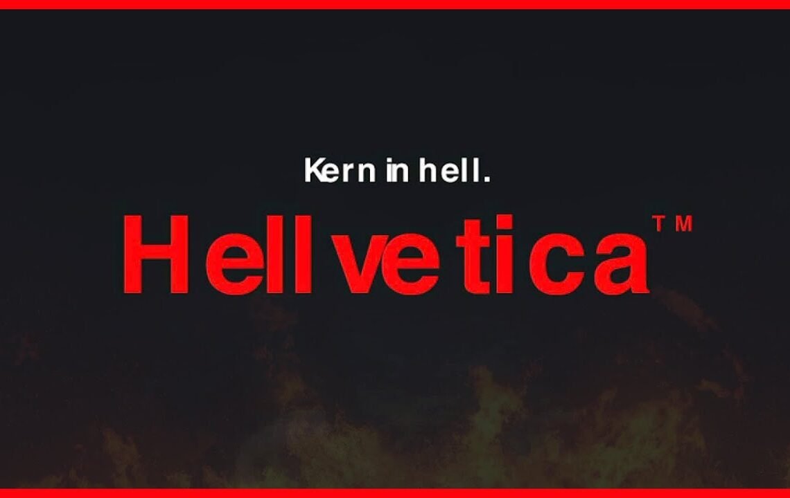
All right, so this is a very different kind of video that I’m doing for you today, but one that I think you guys will find hilarious and just good fun. You must have seen this recently pop up in one of your news feeds – Hellvetica. Not just any old typeface of Helvetica, but a purposely wrong version called Hellvetica. This is how Helvetica is turned hellish, and it’s a nightmare for graphic designers.
Designer’s Worst Nightmare
If you’re a designer, you must have encountered this font at some point. The idea behind Hellvetica is to purposely turn the font wrong, making it a challenge to kern correctly. Kerning is the spacing between characters in typography, and it’s essential to get it right for a polished design.
Kerning in Hell
I decided to take on the challenge of kerning Hellvetica to show you my process. Kerning is often overlooked in design, but it can make a huge difference in the final outcome of a project. By practicing kerning, you can improve the overall look and professionalism of your designs.
When kerning in Hellvetica, I first compared it to the real Helvetica to see the differences. Using keyboard shortcuts, I adjusted the spacing between characters to try to get it as close to the real Helvetica as possible. Circular letters like ‘e’, ‘s’, and ‘o’ are trickier to kern and should be closer to the adjacent letters.
Practice Makes Perfect
Kerning takes practice, and Hellvetica is a great way to hone your skills. By working on challenging fonts like Hellvetica, you can improve your kerning abilities and create more professional designs. Remember to pay attention to spacing between different types of letters and adjust accordingly.
Overall, kerning in Hellvetica was a fun challenge and a great way to test my typography skills. I encourage all designers to practice kerning and pay attention to the details in their designs. It may seem like a small aspect, but kerning can make a significant difference in the overall look and feel of a project.
And remember, if you’re struggling with kerning, there are resources and courses available to help you improve your skills. Don’t overlook the importance of kerning in design – it can truly make or break a project. So, embrace the challenge of kerning in Hellvetica and elevate your design game!
FAQ about Hellvetica: A Graphic Designers WORST Nightmare 🤮
What is Hellvetica?
Hellvetica is a parody font created by a graphic designer as a humorous take on the classic Helvetica font. It is intentionally designed to be difficult to read and visually unpleasing.
Why is Hellvetica considered a graphic designer’s worst nightmare?
Graphic designers often strive for clean, well-designed typography to convey a message effectively. Hellvetica goes against these principles by being intentionally ugly and hard to read, making it a nightmare for designers who value aesthetics and clarity in their work.
Is Hellvetica meant to be used in professional design projects?
No, Hellvetica is intended as a joke and should not be used in any serious design projects. It is a parody font meant to poke fun at the design community and should be used with caution, if at all.
Can Hellvetica be downloaded and used?
Yes, Hellvetica can be downloaded for free online, but it is not recommended for use in any serious or professional design projects. It is best used for comedic or experimental purposes only.
I hope you find useful my article Hellvetica: A Graphic Designers WORST Nightmare 🤮, I also recommend you to read my other posts in my blog.
If you need help with anything join the community or do not hesitate to contact me.
Please consider joining my newsletter or following me on social media if you like my content.
Leave a Reply