How To Design A Modern Sharp Logo Ep 4 🤓
Are you struggling to create a modern and sharp logo that truly represents your brand? In this episode of our series on logo design, we will explore the key elements and principles that go into designing a modern and sharp logo. From choosing the right typography to creating a sleek and professional color palette, we will cover all the essential steps to help you create a logo that stands out and leaves a lasting impression. So, if you’re ready to take your brand to the next level with a modern and sharp logo, then keep reading for expert tips and insights. Let’s dive in!
Exploring Modern Logo Design
Hey guys, what’s going on? It’s me Will Patterson again with another video tutorial all about creating modern logo designs. Today, I’m doing it a bit differently because I want to create a modern logo that has my name in it, essentially a logo for myself. However, the principles and techniques I’ll be sharing can easily be applied to creating your own amazing modern logos.
Choosing the Right Typeface
As a hand lettering artist who loves vintage typography, I start my logo design process by exploring serif typefaces. However, I don’t want my logo to appear outdated, so I aim to add a modern element to the design.
Crafting a Modern Serif Logo
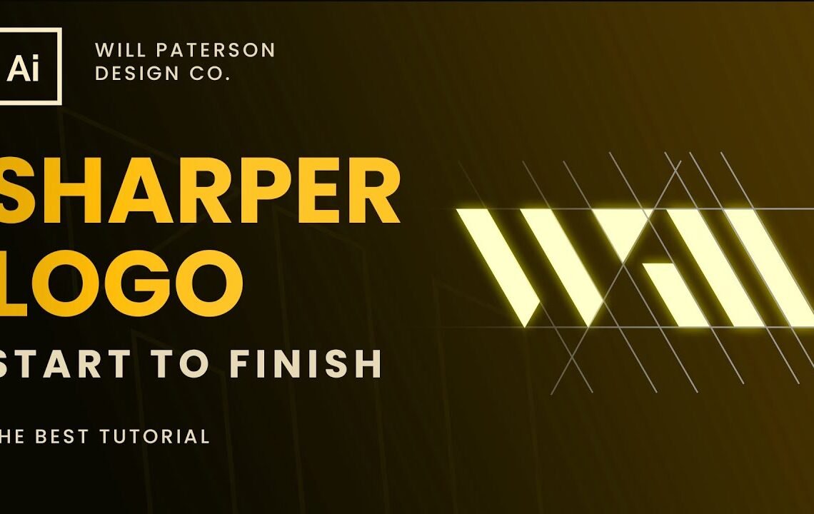
First, I create some guides and a base rectangle to begin crafting the logo. I decide to modify the ‘W’ in my name to give it a modern, abstract look. By adjusting the anchor points and removing serifs, I aim to create a bold and modern ‘W’ that still retains a touch of vintage typography influence.
Turning Negative Space into Positive Design
To further enhance the modern feel of the logo, I experiment with using negative space to give the illusion of serifs on the letter ‘W’. By incorporating polygon shapes and cleverly positioning lines, I manage to create a dynamic and modern ‘W’ design.
Fine-Tuning for Versatile Usage
As a logo designer, it’s essential to consider how the logo will be used across various platforms and mediums. For my personal logo, I pay attention to scaling, alignment, and overall optical balance to ensure it looks great irrespective of its size or application.
FAQ – How To Design A Modern Sharp Logo Ep 4 🤓
Q: What will I learn in this episode?
A: In Episode 4, you’ll learn the principles of designing a modern and sharp logo, including the use of negative space, font selection, and color choices.
Q: Do I need to have design experience to benefit from this episode?
A: No, this episode is suitable for beginners and experienced designers alike. The step-by-step tutorial will guide you through the process.
Q: What tools and software will be used in this episode?
A: The tutorial will demonstrate the use of Adobe Illustrator for logo design. However, you can apply the principles using other design software as well.
Q: Can I apply the principles to any type of logo design?
A: Yes, the principles taught in this episode can be applied to various types of logos, including branding, corporate, and personal logos.
I hope you find useful my article How To Design A Modern Sharp Logo Ep 4 🤓, I also recommend you to read my other posts in my blog.
If you need help with anything join the community or do not hesitate to contact me.
Please consider joining my newsletter or following me on social media if you like my content.
Leave a Reply