How To Kern Professionally. (Not many know this!) 🤯
Are you tired of your designs looking amateurish because the spacing between letters is off? Do you struggle with getting your text to look polished and professional? You may not realize it, but the key to improving the look of your typography lies in the art of kerning. Kerning is the process of adjusting the spacing between individual letters, and it can make a world of difference in the overall appearance of your design. In this blog, we will explore the importance of kerning and provide you with some tips and tricks for kerning like a pro. Read on to elevate your design game and impress your clients and colleagues with your professional typography skills.
How to Kern Professionally (Not many know this!)
Kerning is a huge part of type design and if you’re a graphic designer or creative working with type then you should know how to properly space each character without proper kerning you wouldn’t be able to read as well or as fast and things will get confusing. I’m not talking specifically about Tracking today which is the space between each letter form in a word or a sentence; I’m talking about kerning which is the space between certain characters and letters between other certain characters and letters.
Importance of Kerning
Kerning is crucial for ensuring that the space between each letter is evenly distributed and visually appealing. If kerning is not done properly, it can affect the readability and aesthetics of the text significantly, especially in graphic design and branding.
The Rules of Kerning
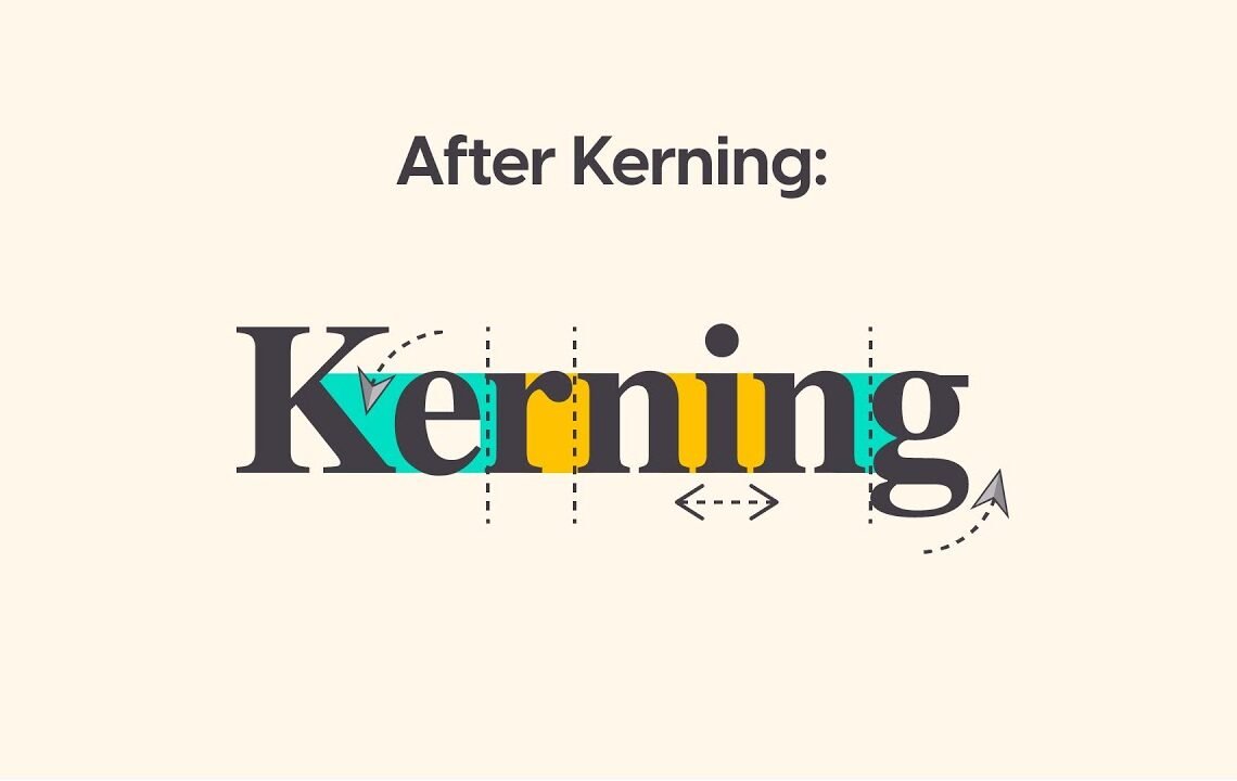
The idea of kerning is to have a nice even optical space between each letter form. For example, in the word “placeholder,” proper kerning would ensure that the space between each letter is visually balanced. The roundness or straightness of the letter forms also plays a role in determining the necessary kerning adjustments. Kerning is not about mathematical precision, but rather about creating an even spread of letter forms that is visually appealing.
Tools for Kerning
Design software like Adobe Illustrator provides tools for adjusting kerning. Designers can manually adjust the space between letters to achieve the desired kerning for an aesthetically pleasing result. Additionally, there are online resources and games, such as “kern type” or “type.method.ac,” that allow designers to practice and improve their kerning skills in a fun and interactive way.
Practical Application of Kerning
When working on logo designs or typographic elements, proper kerning is essential to maintain a professional look. By evaluating the space between specific letter combinations and ensuring a balanced visual appearance, designers can create stunning typography that enhances the overall design. Kerning adjustments can significantly impact the visual cohesiveness and quality of a design.
Visual Evaluation and Adjustment
Designers often use visual cues, such as squinting or adding a slight blur effect, to assess the evenness of kerning. These techniques help identify any irregularities or excessive white space between letters, allowing for adjustments to be made accordingly.
In conclusion, understanding and practicing professional kerning techniques is essential for any designer working with typography. By mastering the art of kerning, designers can elevate the quality of their designs and create visually stunning typographic compositions that captivate and communicate effectively.
How to Kern Professionally FAQ
What is kerning and why is it important in design?
Kerning is the process of adjusting the spacing between characters in a font. It is important in design because it can greatly affect the readability and aesthetics of the text. Proper kerning ensures a visually pleasing and professional-looking design.
What are some common tools and techniques for kerning professionally?
Some common tools and techniques for kerning professionally include using design software such as Adobe InDesign or Illustrator, adjusting the kerning values for specific pairs of characters, and visually analyzing the spacing between letters to ensure consistency.
Are there any resources or tutorials available for learning how to kern professionally?
Yes, there are many resources and tutorials available online for learning how to kern professionally. Websites such as Skillshare and Lynda offer courses on typography and design that cover kerning in depth. Additionally, there are plenty of articles and videos on YouTube that provide tips and techniques for professional kerning.
What are some common mistakes to avoid when kerning text?
Some common mistakes to avoid when kerning text include over-kerning or under-kerning, ignoring the overall balance of the text, and not considering the specific font and its characteristics. It is important to remember that kerning is a subtle art that requires attention to detail and an understanding of typographic principles.
I hope you find useful my article How To Kern Professionally. (Not many know this!) 🤯, I also recommend you to read my other posts in my blog.
If you need help with anything join the community or do not hesitate to contact me.
Please consider joining my newsletter or following me on social media if you like my content.
Leave a Reply