I Paid 5 Designers To Design THE SAME Logo… 💸
Have you ever wondered how different designers would interpret the same logo brief? Are you curious about the variations in style, creativity, and execution among graphic designers? In this blog, I decided to put this question to the test and paid five different designers to design the same logo. The results were surprising and eye-opening, showcasing the diverse perspectives and approaches that designers bring to their work. Join me as I share the insights and lessons learned from this experiment, and discover the impact of individual creativity and skill on the design process. Let’s explore the fascinating world of logo design and the unique talents of graphic designers.
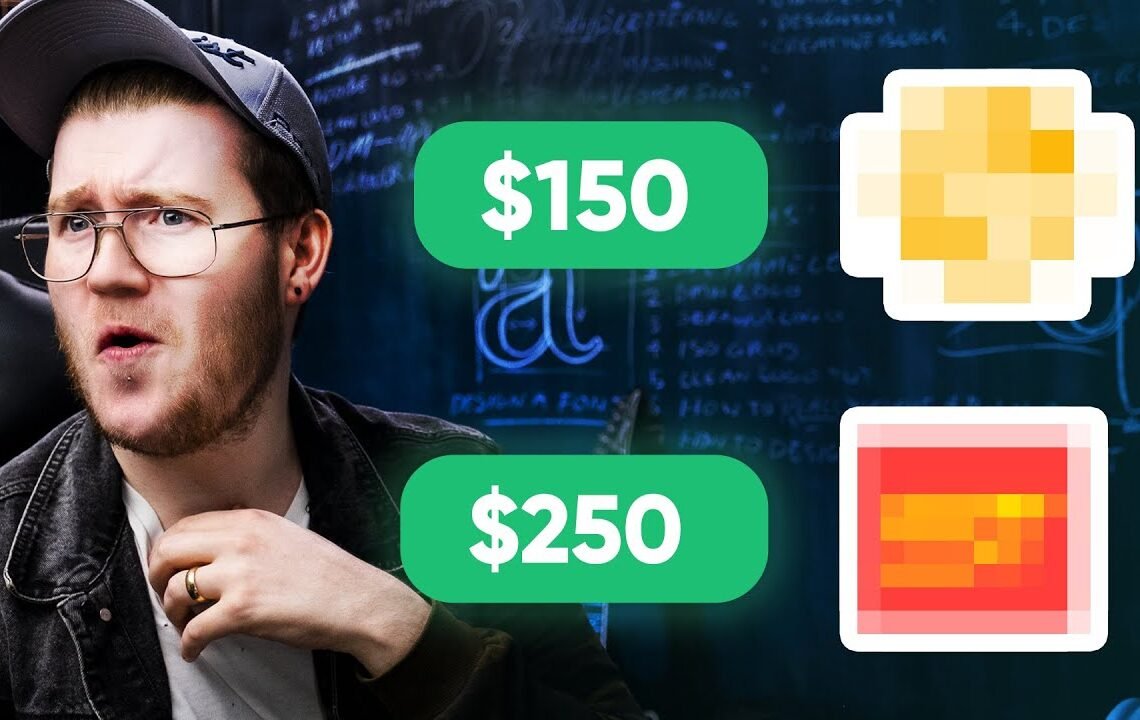
it’s not going to work properly. I like how you’ve kept the line consistent throughout, and you’ve chosen really strong typeface. You’ve used a much modern typeface that suits the company’s description. If I had to criticize one thing, I would say that the logo on its own might be a little bit too delicate, but that’s something that you can easily adjust. I love the way that you’ve shown the presentation and the creativity behind it. And I think for $100, you’ve really nailed it. I think I would pick this logo out of all of them. And it’s not just because it’s expensive, but because it’s a really good logo design. Next up is Matig. Matig is $150. So what did you come up with? You also have used a keynote, which I really like. So you’ve chosen a much more modern typeface, which I completely agree with because millennials don’t want to see something that’s too old. And I really like the idea that you’re going with. This is cool. So let’s keep going forward. What I would say, though, is the contract is a bit too wordy. This is the first time that I’m seeing the logo. And I didn’t expect this. You have a 3D element to it, which can’t be turned into a fave con. And if you can’t turn it into a fave con, it’s not going to work for the company’s social branding. So that’s A big no for me, I’m afraid. Next is Younes. And Younes is €300, which is absolutely insane. So what have you done? Let’s see. So you’ve chosen a very cool typeface for it and this very different than what the other designers have proposed. But overall, I would say that the icons in relation to a logotype seems a bit disconnected. It doesn’t show how it feels, playing a game with the company. It feels very standard and not quite millennial. I like the idea of the elite and of the things of the star because it shows connectivity. I love the idea there. Next up And finally just folded straight in with a signature of +Yaz. So Yaz is $400. The position of Steel Trap is simple and spontaneous. And shows the modernity with both myesign and Sleek icon. The color palette shows the energy and enthusiasm. You have used definitely the best color palette to show the emotion and the vibe of the company. But I’m not sure if this sketching presentation here is needed. I would have liked to see the working out in the sketches. I like the combination marks and the applications. Your sketching is much more vibrant, and there is not wasted line… And if this logo is replicated into a single black and white mark, it won’t transfer over as well. I would have to say that the $400 logo is the most expensive and is the best based on the brief itself. The words that come to mind are energy, vibrancy, and a bit of excitement. The biggest thing I’ve definitely learned from looking at all of these logo designs is that price doesn’t determine quality. And they may be different avenues from different people on how to create outcomes, but sometimes less is more. So a round of applause for Thania, Avelino, Matig, Younes, and Yaz. And thank you again for Framer for sponsoring this video. This was really fun. I would love to do more of these. Let me know if you have anything that you would like to do, and if you enjoyed it, and if you want more videos like this. I really hope that you have a great day, and I’ll see you in the next one. Goodbye.
Frequently Asked Questions
1. Why did you pay 5 designers to design the same logo?
As a way to showcase the different creative approaches that designers could take when given the same design brief, we wanted to explore the diversity in design thinking and creativity.
2. Did you choose a winner among the 5 designs?
Yes, we did choose a design that best suited our vision and brand identity. However, the main purpose of the exercise was to highlight the unique perspectives and styles of the different designers.
3. What was the criteria for selecting the winning design?
We considered factors such as originality, relevance to our brand, simplicity, and versatility in the selected logo design.
4. Will the designs that were not chosen go to waste?
No, the designs that were not selected for our official logo will still be credited to the respective designers and may be repurposed for other branding or marketing materials in the future.
5. Can I use this idea to source logo designs for my own business?
Absolutely! This concept can be a great way to explore various design options and find the best fit for your brand. Just make sure to compensate all the designers for their time and effort.
I hope you find useful my article I Paid 5 Designers To Design THE SAME Logo… 💸, I also recommend you to read my other posts in my blog.
If you need help with anything join the community or do not hesitate to contact me.
Please consider joining my newsletter or following me on social media if you like my content.
Leave a Reply