Logo Hack: The Trick That Changed Everything 👀
Have you ever struggled with creating the perfect logo for your brand? Are you tired of the same old designs and looking for a fresh new approach? Look no further, because Logo Hack is here to change the game. This innovative technique has revolutionized the world of logo design, providing a simple yet effective solution for those in need of a logo makeover. Say goodbye to boring and generic logos, and hello to a new era of creativity and uniqueness. In this blog, we will explore the trick that changed everything and how it can help you elevate your brand to new heights. Let’s dive in and discover the power of Logo Hack!
Logo Hack: The Trick That Changed Everything 👀
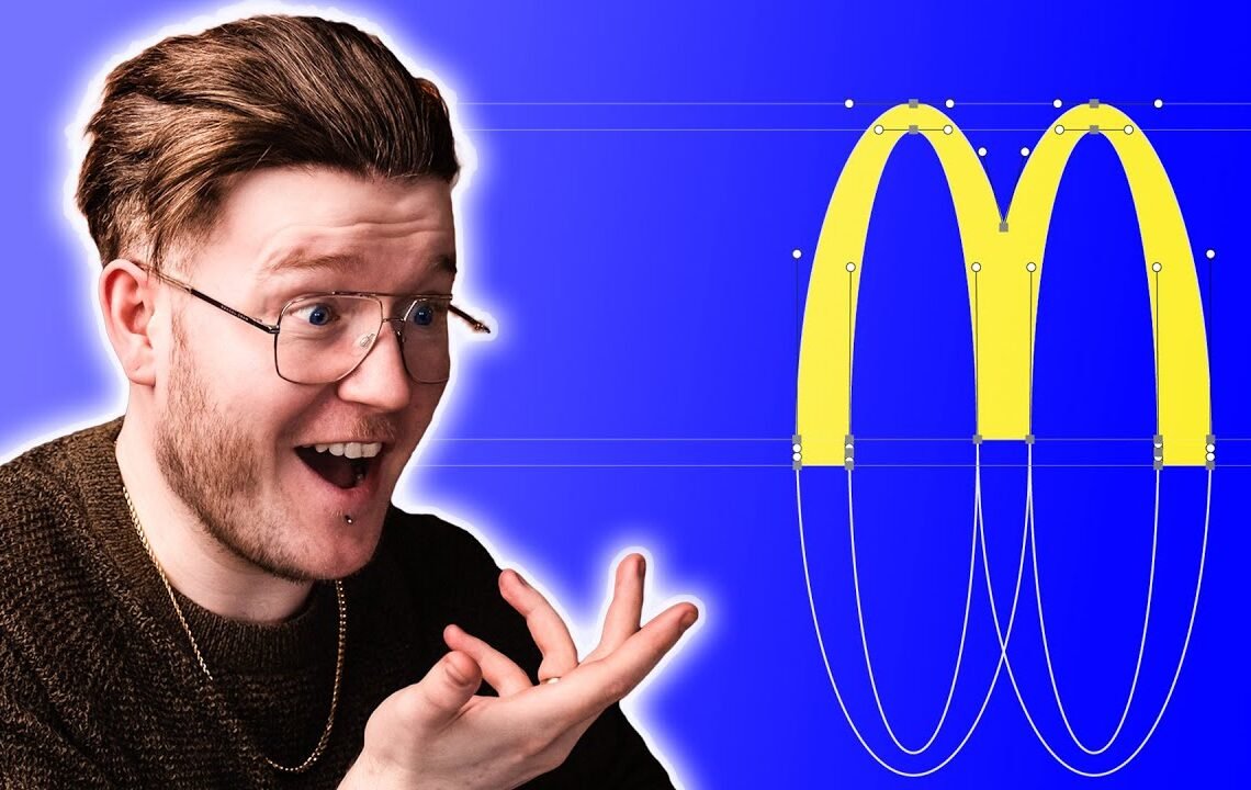
Take a look at these three logos – what do you see on each of these designs that makes them great? There is something that has been designed in each of these logos to make them great. If you didn’t know, it’s called balance. The biggest trick when it comes to great logo design is using balance and symmetry to your benefit. In fact, take a look at the McDonald’s arches. They were very cleverly designed to be symmetrical. This means that in our human brain, we only have to really look at one side and our brain will guess the other side, making it an easy and complete design. If we take a look at the Apple logo, we can see that it is not symmetrical. In fact, if we try to make it symmetrical, it doesn’t look right. But the Apple logo is still balanced. It still feels great. Fun fact: when Rob Janov designed the Apple logo, the reason why he added a bite in there was to stop it from looking like a cherry. The Apple logo is inherently balanced. What about Target’s logo? It is literally two circles with the word Target at the bottom. It is inherently balanced. If we look at each side of the logo with a guide in the middle, we can see that it’s a mirror image on both sides.
Why Do We Like Balance?
As humans, we tend to like symmetry. It alludes to order and calmness. Humans like to use grid systems to create balance. This allows for a sense of wholeness and makes designs easily identifiable at small scales. To prove this point, creating a balanced design using a grid system is quick and easy.
The Box Method
The box method in design is a way to break down designs through grids. Most logos need to fit inside a grid for them to work. By creating an invisible box around a design, you can ensure it is balanced. Testing whether something is balanced or not can be done by drawing a box around it. If the design fits nicely inside the box, it is balanced. Otherwise, it may look out of place. Another method is applying a Gaussian blur effect to the design and seeing if there is an even distribution of mass inside.
Typography also plays a role in balance. The way we view and read words is by mass, not shape. When a logo is blurred, we can see if it is balanced or not. An even distribution of mass inside the design indicates balance.
Testing Balance
Another way to test balance is by creating a mirror image of the design. If the mirrored image looks strange or out of place, the design may not be balanced. Symmetry isn’t always the answer for balance, especially in typography. Understanding how balance affects a design is crucial for creating visually appealing logos.
Balance is key in logo design. It creates a sense of order and calmness, making designs easily identifiable and visually pleasing. By using the box method, testers can ensure a logo is balanced and fits nicely within a grid. Understanding the difference between symmetry and balance is essential for creating effective and aesthetically pleasing logos.
Sponsorship
Before we dive into more details about balance in logo design, a quick shoutout to our sponsor, Squarespace. For graphic designers or those learning graphic design, having a portfolio is crucial. Squarespace offers award-winning, fully customizable templates for building websites without any coding knowledge. With features like online shops and client communication tools, Squarespace is the perfect platform for showcasing your design work. Use the link below for 10% off your first purchase and a free trial to create your own stunning website!
Logo Hack: The Trick That Changed Everything FAQ
What is the Logo Hack trick?
The Logo Hack trick is a technique used to create a visually appealing logo by combining different elements such as shapes, colors, and typography in a creative way.
How does the Logo Hack trick work?
The Logo Hack trick involves taking a familiar logo design and altering it slightly to create a fresh and unique look. This can involve changing the colors, rearranging the elements, or adding new visual elements to the existing design.
Why is the Logo Hack trick considered a game-changer?
The Logo Hack trick is considered a game-changer because it allows designers to create striking and memorable logos by reimagining existing designs. This can help businesses stand out in a crowded marketplace and make a lasting impression on customers.
Can anyone use the Logo Hack trick?
Yes, anyone with basic design skills can use the Logo Hack trick to create impactful logos. However, it is important to respect intellectual property rights and avoid plagiarizing existing designs.
I hope you find useful my article Logo Hack: The Trick That Changed Everything 👀, I also recommend you to read my other posts in my blog.
If you need help with anything join the community or do not hesitate to contact me.
Please consider joining my newsletter or following me on social media if you like my content.
Leave a Reply