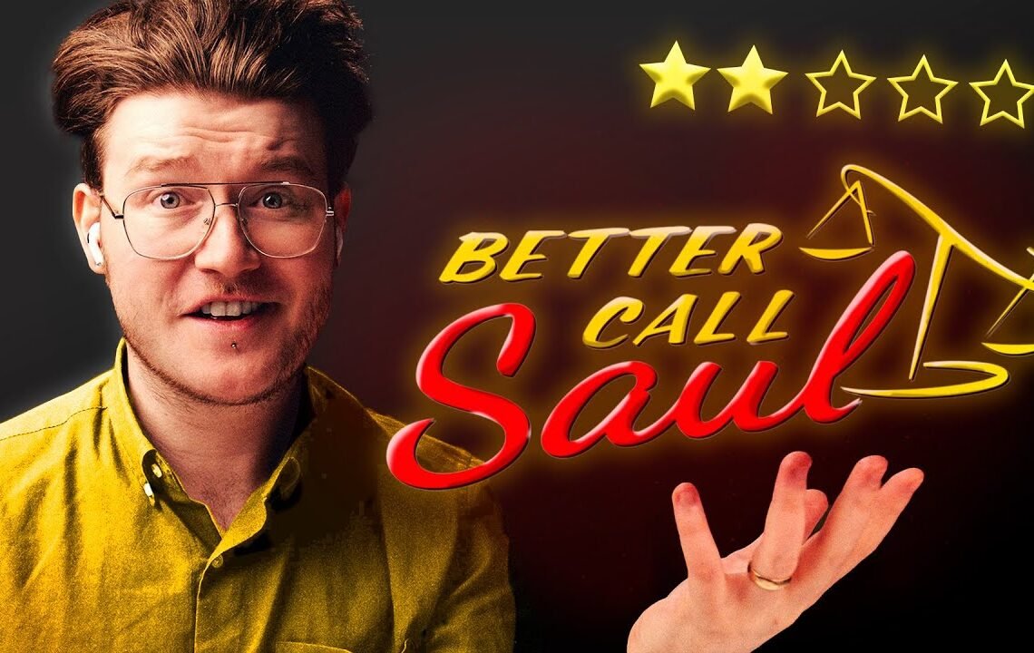
Rating the Logos of Better Call Saul! 🔥
Are you a fan of the hit TV show Better Call Saul? Have you ever taken a closer look at the logos and symbols used throughout the series? In this blog post, we will be rating the logos of Better Call Saul and analyzing their design, symbolism, and overall effectiveness. From the iconic “Better Call Saul” logo to the various symbols used by the show’s characters and businesses, we will be taking a closer look at what makes these logos stand out. So grab your favorite cup of coffee and join us as we dive into the world of graphic design within the Better Call Saul universe!
Rating the Logos of Better Call Saul!
Will Patterson today I’m going to be reviewing logo designs from the hit TV show better call Saw the better called Soul logo is a retro logo type design with a classic sign painters feel the logo was designed by Alan chow who works on Art and Design for Television Productions as a fellow logo designer myself we know whether the logos will work based on these simple factors Simplicity memorability
The Better Call Saul Logo
The Bal Soul logo is designed by Alan chow to look classic and inexpensive normally, a lawyer’s logo would look very firm premium and expensive but because of his type of clients this has changed to more of a friendly and personalized type face. The weights on either side of the logo speak to the balance of Justice something Jimmy makes out to be his true intention when we all know exactly what he’s really looking for. But this wasn’t the first logo designed during pre-production and even more retro design was used it was more of a show card with traditional design and sign painting flares obviously the design looks very similar to the logo we all know and love but I think the final design hits a nail on the head without going too overboard. Overall the design works well as a more classic logo it breaks them all by being in direct contrast to what you would expect from a normal lawyer or solicitor firm and it definitely speaks more towards Jimmy’s or Saul’s personality.
Hamlin, Hamlin, and McGill Logo
In direct contrast to Jimmy’s logo, his brother’s Law Firm logo shows more of a traditional design. Hamlin Hamlin and McGill is a reputable law firm in Albuquerque established by Chuck McGill, Jimmy’s brother, and George Hamlin who took over as a CEO or partner hence the double hamlins in the design. There’s nothing about the logo that really sticks out but to my eye, it just looks very bug standard and corporate perfect for that law firm. Something I would do to make the logo more consistent is to increase the thickness of the boxes to make them more consistent with the type thickness. As we go through the series Jimmy and Kim join forces together and incorporate Wexler McGill the logo they use is a monogram the W and the M are mirrored to show partnership which works quite nicely. Something interesting I’ve noticed about the design is that it looks like a graph increasing and then decreasing representing Jimmy’s life and Kim’s increase in success in the middle of the series and it also represents the sort of character path of s when you invert the design you see a massive crash happening towards the end.
El Grico Gidor Logo
El Grico Gidor aka the Greek Winker is a restaurant specializing in Mexican style ice cream used as a front by the Salamanca family to smuggle drugs across the US Mexican border using a fleet of trucks. The logo itself is very expressive and illustrative not a bad thing when it comes to restaurants wanting to show a bit more personality. According to Alan chow the designer of this and many of the logos throughout the Bal S Series saos Spanish is not my strong part sabroso can’t say it translates to little tasty which we learned from the wiki trivia that also represents Don alario the leader of the cartel it’s a fun little design with a bit of an Easter egg involved and it’s perfect fit for a show so I can’t mark it down for being overly complicated.
Mesa Verde Bank and Trust Logo
Mesa Verde Bank and Trust is a financial institution located in albu New Mexico originally represented by the law offices of Hamlin and Hamlin and McGill before taking the services of Kim Wexler. The M logo itself is very basic and nothing special but the story behind the design is anything but the logo was copied from a photograph from the oldest character in the Breaking Bad Universe Olivia bitsui and the dispute between Mesa Verde and Everett Aka over the construction of a call center. Interestingly though this isn’t the only logo used in the series for M we have a more modern icon a word Mark combo used on the letterheads throughout the series which points towards a different side of the bank maybe a more modern side the icon looks like a double of the No Man’s Sky logo like a diamond shaped monolith I’m not entirely certain why they have two logos but they do appear at different times throughout the series.
If you enjoyed this article, consider subscribing for more logo breakdowns from the Breaking Bad universe!
FAQ
What is the purpose of rating the logos of Better Call Saul?
The purpose of rating the logos of Better Call Saul is to analyze and critique the design elements of the logos used for the show, such as color, typography, and symbolism.
How are the logos rated?
The logos are rated based on various factors, including creativity, originality, and how well they represent the themes and characters of Better Call Saul.
Who rates the logos?
Logos are rated by a team of graphic designers, branding experts, and fans of the show, who share their insights and opinions on the logos’ design and effectiveness.
What can we learn from rating the logos of Better Call Saul?
Rating the logos of Better Call Saul can provide a deeper understanding of the thought process and creativity behind the show’s branding, as well as insights into the impact of visual design on audience perception.
Can I submit my own rating of the logos?
Yes, you can share your ratings and thoughts on the logos of Better Call Saul through social media or by participating in discussions and polls related to the show’s branding.
I hope you find useful my article Rating the Logos of Better Call Saul! 🔥, I also recommend you to read my other posts in my blog.
If you need help with anything join the community or do not hesitate to contact me.
Please consider joining my newsletter or following me on social media if you like my content.
Leave a Reply