Redesigning My Subscribers Logo! (Big Change)
Have you ever felt like your brand’s logo just isn’t quite cutting it anymore? Maybe it’s outdated, or it doesn’t truly reflect the direction your business is headed in. As a content creator with a growing subscriber base, I recently found myself in this predicament. After much contemplation and feedback from my loyal subscribers, I knew it was time to make a big change – I decided to redesign my logo! In this blog, I’ll share with you the process of revamping my logo, the thought and creativity that went into the new design, and the positive impact it had on my brand. If you’re considering a logo redesign for your own business, I hope this inspires and guides you in the right direction.
[et_pb_section fb_built=”1″ _builder_version=”4.0.9″ custom_padding=”0px|||||”][et_pb_row _builder_version=”4.0.9″][et_pb_column type=”4_4″ _builder_version=”4.0.9″][et_pb_text _builder_version=”4.0.9″ hover_enabled=”0″]
Redesigning My Subscribers Logo! (Big Change)
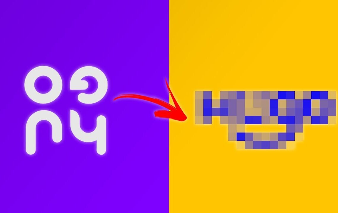
Over on twitter, I asked you guys to send me in a bad logo, a logo that doesn’t work, and I would just redesign it just so I had something to do for a video. The first person who sent this to me is Hugo, and he sent this logo to me which was – it looks okay, I wouldn’t say it’s terrible, it’s just a bit complicated. I get it, but I wanted to try and make this a bit more modernized, a bit better for him, and more functional, so watch the end of this video to see the final version of what I did. But here is the process on how I went ahead and fixed the logo.
The Sketching Process
The first thing I do is sketch. I just go ahead and sketch some ideas. I wanted to use the word “Hugo” because he’s used it in his logo. I didn’t want to stack it up though. I wanted it to be a bit legible. Now obviously he gave me no context as to what this logo is, but most of my followers are designers, so I thought, you know, he’s probably a graphic designer or a logo designer, so I’ll go ahead and make this for him in that sort of fashion – quite modern and clever.
Feedback and Refinement
Jordan, the video editor, came and had a look at the logo and sort of thought that the first version that he did was kind of like two people talking. I wanted to get this idea of a smiley face in there because there was nothing else to go off. I just wanted to do something and make him happy with it. So, I started playing with the idea of adding curves in there. I wanted a clean, tight face, but I wanted it to be fully customized, so I wanted loads of curves in there.
Using Adobe Fresco for Precision
I kind of like the look of that, so I went ahead into another app called Adobe Fresco, which allows me to do a bit more precise drawing, so I can use shapes to use as guides and rulers to make these a bit more precise before I go into Illustrator.
Refining in Illustrator
When I bring it into Adobe Illustrator, I start gridding everything up with guides. It’s super important with logo design to have guides. If you don’t know, guides are what keep things consistent all the way throughout, so I wanted to make sure that each letter form has consistent width and spacing.
The big problems that I have with these types of logos is too many things are distracting. I wanted to keep it nice and simple and just keep it on board with the principle of just getting a smiley face in there and leaving it very open so those two eyes or the ascenders if you will of the “U” had to be just right.
Thanking the Sponsor and Final Thoughts
Before I go into the next part, I just want to thank the sponsor of this video, Framer. With the way the design industry is going, learning how to prototype is a no-brainer. Instead of putting flat files in front of your team manager or client, imagine being able to hand them a prototype that’s so good it feels like a real app or website. Create your own smart components complete with multiple states without code. Drop in pre-built components with the insert menu and make your own delightful custom animations 100% visually. In just a couple of hours, you can have a new skill that helps you stand out from the crowd. Sign up to Framer for free at framer.com/willperson. The link is in the description below.
In conclusion, redesigning Hugo’s logo was a fun process of sketching, refining, and refining again. The end result was a modern and clever logo that represents his name and personality. I’m excited to see how Hugo will use this new logo in his work, and I hope it brings him success and joy.
[/et_pb_text][/et_pb_column][/et_pb_row][/et_pb_section]Redesigning My Subscribers Logo! (Big Change)
Q: Why are you redesigning your subscribers logo?
A: We believe it’s important to refresh our brand imagery to stay relevant and meet the evolving needs and expectations of our subscribers. We want to make sure our logo represents who we are today.
Q: Will the new logo be a big change?
A: Yes, this redesign will be a big change. We’re aiming to create a logo that better reflects our brand’s identity and resonates with our subscribers in a meaningful way.
Q: When can we expect to see the new logo?
A: We’re working hard to finalize the new logo, and we’ll be unveiling it to our subscribers very soon. Keep an eye out for the big reveal!
Q: Will the old logo no longer be used?
A: Once the new logo is launched, it will replace the old logo across all our platforms and communications. The old logo will be officially retired.
Q: How can I provide feedback on the new logo?
A: We value the input of our subscribers, so we’ll be providing an opportunity for you to share your thoughts on the new logo once it’s unveiled. Your feedback is important to us!
I hope you find useful my article Redesigning My Subscribers Logo! (Big Change), I also recommend you to read my other posts in my blog.
If you need help with anything join the community or do not hesitate to contact me.
Please consider joining my newsletter or following me on social media if you like my content.
Leave a Reply