Reviewing My OLD Logos! (10 Years Ago) 500K Special
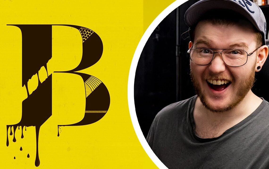
Do you ever look back at your old work and marvel at how much you’ve grown since then? As a graphic designer, I often find myself taking a trip down memory lane and revisiting the designs I created in the past. In celebration of reaching 500K followers, I decided to take a look back at my old logos from 10 years ago and review how my style and skills have evolved over the years. Join me on this journey as I reflect on my old designs and share the lessons I’ve learned along the way.
Reviewing My OLD Logos! (10 Years Ago) 500K Special
We have done it we’ve actually reached 500 000 subscribers that’s half a million and because we’ve reached this milestone on the channel which i’m super happy about i’m gonna go ahead kind of embarrass myself by showing you some work that you’ve never seen of mine from the beginning of my design Career also this is part one of my 500 000 video because we’re going to be redesigning a couple of these projects in the next part of this video which will be really fun to see how much better i am now than i was there this video is brought to you by Freshbooks okay so i’m on my b hands and you won’t see these on my public behance because on my general public one you’ll see that i’ve only got a few projects on and even these are quite old but in my drafts i’ve got some strange designs and i have not updated these in Years so basically i’m going to show you my design work from back here so we’ll start off with not this one uh but let’s let’s look at it let’s edit this one this is prophecy apparel which if you are a fan from way back when you’ll know that this is the logo Of it and i was quite proud of being able to animate this into a gif of different colors and this is just a logo business card i had breakdesigns.cod at uk as my website my actual name in design was break designs but you can see that The work here is not too great i don’t mind the t-shirt designs these were pretty cool to be fair i enjoyed making them i got these printed and people did buy them and it was good fun to do but this was the start of my design Career i was trying to find ways of making money and i knew that i liked clothes i like style and fashion so why don’t i go ahead and make some cool shirts and different things like that a company around that yeah the logo is a bit strange i’m not too sure why It’s in this way i mean the icon is just an icon with the word written in it in a font because i couldn’t letter out anything out not too sure why i had this either made no sense but you know as a new designer back in the day Years and years and years ago i would just do anything that would look cool i think this is my rebrand so i changed my brand somehow i can’t remember what my first logo was ah yes so this is brake designs 2013 it’s like a post-modern vintage idea so bd2013 How how many years ago was that that’s eight years ago so this is eight years ago this work that’s insane wow this is embarrassing because look so many mistakes again i’ve got a letterhead so i’m doing like brand identity trying to show people what the letterhead would look like And i kind of like this because it had some hand lettering flourishes in it which made more sense for me at the time but again just doesn’t really make sense what’s this one this one looks horrible oh yeah so i started doing poster design so um this is just me showing a poster What draws people to be friends is that they see truth and i think i got the quote from somewhere wanted to do something with it and create a poster and this is how i started doing hand lettering so i would like to get fonts and play some you Compose them but then after a while i started wanting to do proper hand lettering and i’m going to show you some of my work now like recently so it doesn’t look so awful this one looks really bad so i don’t know what was going on with this Icon you can see the p and the o and the s all strangely not curved or anything this is going to be hecka embarrassing this one was from like 2012 so it’s a long time ago and yeah the poster design makes no sense whatsoever you can see i’ve got like this background This nice color picture in the background with you know great designs will pass oh that was my first logo you see this thing in the middle this tiny thing that was my logo i don’t know what it meant i think it was just a break in the Middle so this is where i sort of went you know illustrator and typographer which made no sense because i didn’t really know what my title could be to show people so i just decided you know flyers posters and logos all in different fonts you know i had fun with it it was great So it’s quite a long time ago what’s this one so this is the alpha amiga project can’t remember oh yes so i saw someone online and this was done i think in 2011 saw someone online creating you know one letter illustration so spending a lot of time On one letter and i wanted to create a poster and maybe sell them or just to do as like a little portfolio project of each letter of the alphabet and i don’t know how many i got to the f so see here’s the a the first and the Best letter of the alphabet brilliant is it the best though there’s a mock-up looks terrible on the mock-up b i remember doing this one that’s insane so again i’m trying to do anything to make this a bit better but you can see where i’m coming from in illustrator Back in 2011 2012 i’m just playing around with it seeing what i can do and this is why i learned i was just learning by doing always using this font it’s wisdom script i swear this one see i kind of like this one actually apart from i don’t know where the negative Space has gone in the bowl of the sea but i created that i think in photoshop yeah i’ve got a speed design here on vimeo that’s hilarious this is me creating the c and then putting it into cinema 4d so i use cinema 4d to create that that’s insane D just again i kind of like the look of this you can see what vibe i was going for but again doesn’t work out e just kind of looks so weird why is it wood e for excellence excellent and then f f for funny i kind of like this one Though it kind of looks a bit weird yeah i’ve got the o’s around there you can see i was working out the o with the script f i wanted to like you know fill in the space see what i could do but the main Part of this is that i was trying i was trying to you know learn design and this is what everyone goes through when they’re beginning to learn design you may think this is horrible i see this as progress right next one what’s this one define yourself let’s have a look write Your own story ah cool yeah write your own i like that it must have been just something i was passionate about merry christmas let’s have a look so this is a christmas one from 2012 i believe merry christmas ever happened here yeah so you can see why i wanted to do hand Lettering because i wanted to do poster design and just using fonts was annoying to me and i got frustrated when i was on holiday that’s how i started with hand lettering and again here i was actually making tutorials after this i think it was in 2012 i started making tutorials and that’s When i started to really learn design by reading books and everything you know designs for…
FAQ: Reviewing My OLD Logos! (10 Years Ago) 500K Special
1. What is the 500K Special about?
The 500K Special is a celebration of reaching 500,000 subscribers on our channel. As part of the special, we are revisiting and reviewing our old logos from 10 years ago.
2. Why are you reviewing your old logos?
As a way to celebrate our milestone and to reminisce about our journey, we want to take a look back at where we started with our logo designs. It’s a fun way to see how our branding has evolved over the years.
3. Will you be redesigning the logos during the special?
No, the focus of the special is on reviewing and reflecting on our old logos. While we may discuss how our current logo has evolved from the original designs, we will not be redesigning them during the special.
4. Can viewers participate in the review process?
Absolutely! We encourage our viewers to share their thoughts and memories about our old logos in the comments section of the special video. It’s a great way for our audience to engage and share their own experiences with our branding.
5. Where can I watch the 500K Special?
The 500K Special will be available on our YouTube channel. Be sure to subscribe and turn on notifications so you don’t miss it!
I hope you find useful my article Reviewing My OLD Logos! (10 Years Ago) 500K Special, I also recommend you to read my other posts in my blog.
If you need help with anything join the community or do not hesitate to contact me.
Please consider joining my newsletter or following me on social media if you like my content.
Leave a Reply